Checkbox
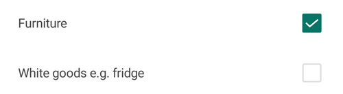
A simple checkox to allow selecting one or more options.
How to use this component
Must be used along side a label to explain what the checkbox is for.
Code Resource
<inputs:Checkbox Checked="DumbTypeSelected_Checked" IsChecked="{Binding Selected}" />- IsChecked
- State of checkbox
- Checked
- Triggered when checkbox is clicked
How should this component look?