Vertical inverted button
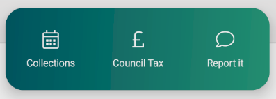
A vertical button that has inverted colours used on the homepage in the shortcut bar.
Base component is StateButton, more info here – https://github.com/IeuanWalker/Xamarin.Forms.StateButton
How to use this component
Should be used on a main route screen when there is a requirement for a lot of menu options.
Should be used when the background colour is opposite to the main back background colour
Can only be used with short titles and must have a suitable icon.
Code Resource
<buttons:VerticalInverted Grid.Column="0"
                          Clicked="LoadCollections"
                          Icon="{x:Static styles:IconFont.Calendar}"
                          Opacity="1"
Text="{x:Static resx:AppResources.BtnCollections}" />- Text
- Sets the text displayed on the button
- Default is String.Empty
- Icon
- Sets the icon (right side of text)
- Default is String.Empty
- IconFontSize
- Sets the Icon font size
- Default is 26d
- State
- This changes based on the button state.
- Options are Pressed or NotPressed
- Default is NotPressed
- ClickedCommand
- Triggered when the button is pressed and released
- PressedCommand
- Triggered when the button is pressed
- ReleasedCommand
- Triggered when the button is released
- Clicked
- Triggered when the button is pressed and released
- Pressed
- Triggered when the button is pressed
- Released
- Triggered when the button is released
How should this component look?