
Button (Forms)
Buttons are used to open up forms or to start our apply, report and request processes.
How to use this component
Buttons should be used whenever a process needs to start, or when linking off to an external solution such as:
- Starting a web form
- Starting an API process
- Linking to a third party application
How should this component look?
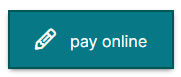
Code Resource
<a class="form_button" title="Report a problem" href="#" target="_blank">Report a problem</a><controls:ButtonFull ButtonIcon="{x:Static styles:IconFont.Report}" ButtonLabel="Report a problem" />.form_button {
background: rgb(7,120,134)!important;
padding: 16px!important;
float: left;
margin-left: 0px!important;
border: 2px solid #045757!important;
font-size: 1em!important;
font-weight: normal!important;
padding-left: 25px!important;
padding-right: 25px!important;
cursor: pointer;
text-decoration: none!important;
color: white!important;
}
.form_button:hover, .form_button:focus, .MainFormButtonWrap a:hover, .MainFormButtonWrap a:focus {
background: rgb(11, 139, 155)!important;
}